Make Decisions With Data, Not Anecdotes
Once upon a time while working on a project with Liam Maxwell he encouraged the team to make proper user-driven product decisions rather than using their own best guesses with the exhoratation “The User Research team has data, you just have anecdotes.” A great point and not one I’m going to belabour here - but I want to do the same thing with making code changes to software.
Collect all the stats
Your software and the machines it runs on likely record a huge amount of data already. Machine CPU usage, free/used memory, disk I/O rates, number of open network connections, response time for completed requests, number of logged successful requests, number of exceptions caught in SQL access layer - these are all things that most applications and most machines will already report on without much particular thought given to designing for capturing metrics and monitoring.
Using tools like AWS Cloudwatch to expose and Prometheus or statsd to collect these machine stats and tools like Elasticsearch, Logstash/Rsyslog and Kibana to pull out and aggregate interesting parts of your application logs you can build up an impressive array of active and reactive monitoring options for your system. ELK is very useful to be able to add to an existing system that has not been designed with monitoring in mind. Looking at the application log format (you should have a common format across the app) will let you quickly create a few log parsing templates to pull out timestamps of log events, exception messages, request paths and timings, originating class of stack traces and gives you the ability to aggregate these across app servers and start searching on them and graphing their occurrences.
On one previous project, for example, we used a neat little wrapping function on our controller classes that looked a bit like this (taken from a Scala & Play app):
def time[A](request: Request[A], handler: Request[A] => Result) = {
    val start = new DateTime()
    val response = handler(request)
    val timeTakenMs = DateTime.now.minus(start.getMillis).getMillis
    StatsdClient.timing("HttpRequestProcessingTime", timeTakenMs)
    response
}
This meant that we just need to prefix our request handlers in the controller classes with time and it’d start the clock at the beginning of the request, stop it again once we’d handled it and then send a request off to statsd to collect the timings directly from our application, without the difference in value if we’d tried to collect it further up the stack at a load balancer or similar.
Collect all the stats some more
Going above and beyond built-in counters and generic app server/platform stats, measuring application-specific behaviours is really useful. You can collect information at a higher level by using things like Dropwizard Metrics or custom-writing your own functions which time certain actions or count certain events (e.g. recording the number of pending file downloads in a queue). Collecting these business-level metrics can help illustrate the ways in which real users are actually using the system so that you can build up a better picture of the operational system than your assumptions of how it will run or how it will be used.
We also used our statsd client from the timing snippet above to log certain important events as I mentioned earlier, like BatchFileCreated and BatchFileCompleted and so on which would let us pull out and graph specific times or distributions of things like how long it took to produce batch files or how often the runner processed them. Tracking these application level events gave us valuable insights into the performance and behaviour of the system.
On another project one of our ops wizards created a custom stats extractor script which pulled certain types of data counts from a production database read-replica and POST-ed it directly off to Prometheus for collection. This was really useful because it lets us keep an eye on how certain transactions were building up and completing from the database side and we could then pump those stats into the same dashboards and graphs that Prometheus gave us.
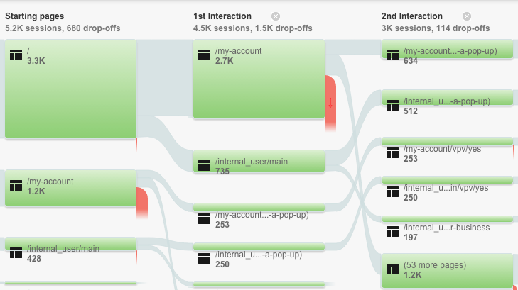
One of the easy ways to get insight on what users are doing on the front end is by adding Google Analytics or Piwik into your web app to track progress through pages and tie together the journeys that users make on the system. Building this in alongside custom-collected stats from the frontend application can help diagnose issues and reveal more about how people really progress - do they just go to the main category page and search for items to buy or do they land on an offers page and then click through the recommendations? For example, is there a technical problem with the component responsible for processing payments today because it’s reporting 45% less throughput, or if you look at the user flow can you tell there’s a lot less click-through from the main special offers page which would explain the reduction in payment processor work?
Graph all the things
Prometheus and AWS Cloudwatch also rather helpfully have their own dashboards integrated and will gladly display all sorts of graphs from collected stats until the cows come home. Kibana is also great at showing dashboards of graphs from stats you have aggregated out of your log events. Below I’ve shown the graphs of response times that we use Kibana to pull out of different layers in one application I’ve worked on to display the different response times as determined by each layer.
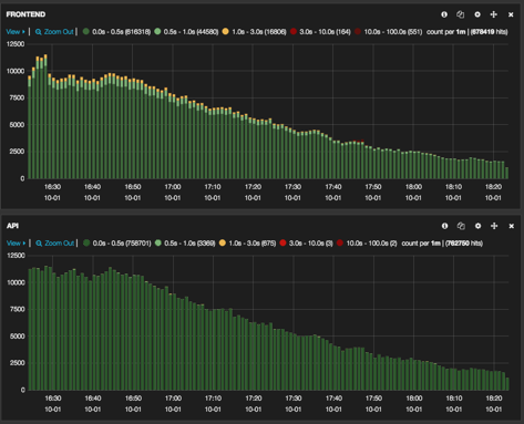
When working on some changes for refactoring out an additional component for the system we were careful to run representative performance tests on the application with the component removed and its responsibilities subsumed into our frontend application servers. You can see that the response times of the application during a peformance test of the main user journies were almost identical between the first test (component refactored out) and the second test (feature toggle flipped and component present again).
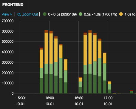
There appears to be - and is when looking further into the data - a 2% increase in response times for the suite of results when the component is refactored out. Is this bad? Should we leave it in and keep the feature toggle flipped? Collecting lots of data about our system gives us the opportunity to determine if this performance difference is statistically significant or not. It’s also very useful to compare different types of graphs to correlate impacts and to help identify the causes or knock-on effects of changes made to the system. Below I’ve included results from cloudwatch showing the frontend machine CPU usage during the different performance tests.
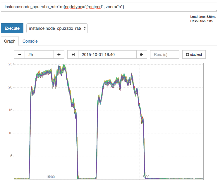
From this we can tell that there was likely a performance hit of about 2% on the response times because the CPUs on the frontend servers were doing about 3-4% more work. That’s actually a good result because the components that we removed during the refactoring account for machine resources equal to 25% of the cluster of frontend servers that we have now taking up the slack. So we’ve reduced the amount of machines (and cost!) and we’ve only seen a 2% performance drop, which means we can make educated decisions about how much we could bump up the resources available to the frontend servers to compensate, or if in fact the business would rather just bank the cost savings because the real-user impact is negligible.
Theory of constraints for developers
So now you’ve got loads of graphs and dashboards and a truckload of hard drives worth of stats and logs - so what? Well, now you can do as mentioned at the start and begin to make decisions about changes to your application with real hard data instead of guesswork or supposition. When seeking to make performance or throughput improvements, be it to steps in a development team’s workflow or a chain of requests from client browser down to a database and back, the governing constraint on the system will be the one most restricted part; the bottleneck.
If, for example you’ve got a load balancer that can handle 10k requests per second and a frontend application server that can handle 6k requests per second and a backend application that can handle 2k requests per second and a database that can handle 9k requests per second - it should be obvious where you should start to make your performance changes. Getting to the point where you can produce these stats, however, is critical to start making any performance changes based on actual data and not just feelings. If you’ve got a system that appears, upon inspecting the load balancer’s output logs, to be handling 2k requests per second the next step is not to immediately start upping all the connection limits and adding indexes to more tables in the database to get more throughput.
Once you’ve got the stats from each of your layers (be it from inferred from logs or from explicit stats collecting) you can then sketch out where the constraints live. Importantly, while the database indexing or frontend app server connection limit changes probably sound good in and of themselves, and should be done as a matter of course, there is provably no system-wide benefit in making any change to any other part of the system until the backend application server is no longer the bottleneck. It’s simply a waste to spend time and money to add those indexes or throw more RAM at the frontend server until you’ve already made all the improvements you can to bring the backend server up to more than 6k requests (at which point your attentions focus next on the frontend).
Making dashboards that business users care about
Having pulled higher level stats out of the application you can also start making dashboards that instead of just showing uptime and CPU usage and free memory can also show metrics and graphs relevant to business people. Based on the custom stats extracting that one of my colleagues made on a project, we were able to add components like this to our main dashboard rotation, showing the headline figures that people who sign cheques care about - and making that visible to the entire team so that developers, ops, testers etc can all now be clued in on the ongoing operation and the impact that the work they’re having has on what is the bottom line to the project.
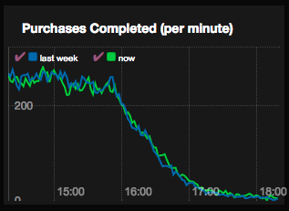
We can also show them trends of business metrics, and comparisons across them such as tracking current sales to the previous week. In the graph below we can plot the number of completed purchases throughout the day and put this up on a dashboard in real time - and compare it to the same stats in the database from this time last week. This would be interesting to compare when a marketing push goes out to see what effect that has had, and also can show you things like if users are experiencing a higher rate in dropped or incomplete transactions compared to some time ago which could a recent change to the process might need to be adjusted - or even if a trough appears due to some system issue that we know to expect a corresponding peak when the activity picks back up.
Bonus: Get woken up at 2am
Another great thing that you can do with this kind of data is turn passive reporting into active monitoring by tying it into alerting tools. Cloudwatch Alarms and Prometheus Alerts give you a lot of options out of the box, and software like Ganglia and Nagios pretty much live for this. There’s a whole world out there I couldn’t do justice to here that is for integrating with email alerts and more, like SMS via services like Twilio or PagerDuty. Avoid signal to noise ratio problems by only setting email alerts up for things that should cause an ops or dev person to go and do something. My advice is to pick your thresholds well and to keep SMS and that kind of alerting limited to things that should really get someone out of bed at 2am: the master database isn’t responding to health checks = fair; 1 of 32 frontend servers returned a single request with latency of > 10 seconds = that way madness lies.
Data-driven decisions
Deming once reportedly said “In God we trust; all others must bring data.” Making decisions about how to change the flow of the system, how to improve performance, and to justify a new design change are all more easily made when you have good data to back you up. Knowing more about how real people use the system, how it behaves in production and how it responds to your changes gives you the confidence to know you’re making good decisions. Testing a technical spike and gathering stats can also help make the case to business sponsors for design or architecture changes that they would otherwise see as risky and gives you an ally in your arguments. Exposing this data and making it available to the whole team means you can improve ops, development and product decisions. To get started on existing projects look at gathering this data from both the user and existing log angles; adding Google Analytics and ELK can enable you to find out more useful information from the data you already have without yet changing the application.
Thanks to Rory Hanratty and Kyle Thompson for review comments.
blog comments powered by Disqus